PaceGuru 2.0: Linked Charts — See Every Detail of Your Run at a Glance
You finish a 10K, open the run details, and see five separate charts — pace, heart rate, power, cadence, elevation — each on its own. To answer "did my pace drop when my heart rate spiked in km 5?", you jump between charts, eyeballing the time axis.
This update aligns them, one to one.
The trouble with charts that don't share a screen
Running is a multi-variable sport. Pace, heart rate, power, cadence, elevation — each tells one side of the same story. But the story is only complete when you compare them at the same moment in time. On PaceGuru's detail page, there isn't room to fit them all on one screen, so you scroll back and forth, jumping between charts.
A real example:
-
You see heart rate clearly climbing in the second half. Are you fatigued? Is it uphill? Or did pace just pick up?
-
From the heart-rate chart alone, you can only guess. You flip to the pace chart, find the rough moment, flip to the elevation chart, then flip back to compare.
What this burns isn't physical energy — it's attention.
Sync Charts: every curve sharing one timeline on one screen
What Sync Charts (Linked Charts) does, in one sentence:
Drag your finger on any chart, and every chart's indicator line moves in sync at the same moment, showing each curve's value live.
Open any run, tap Sync Charts, and you'll see:
Two cursors, not one
This was our first design decision, and it's where we differ from most fitness apps.
Apple's Fitness app has a similar feature, but only one cursor — drag it and see what each metric is at that moment. That answers "what happened at this moment".
We give you two. Because the most common question in run analysis is actually:
"Between this segment and that segment, where do the numbers change?"
Two cursors let you compare directly:
-
How many seconds apart are the paces at km 3 vs km 7
-
How much heart rate differs on the uphill vs the downhill
-
How much power differs in the warm-up vs the sprint
Drag either one, and every chart's values follow. You don't have to hold numbers in your head — the charts remember them, and let you compare data changes across stages directly.
Color coding, distinguishable at a glance
Each curve has its own color:
| Metric | Color |
|---|---|
| Pace | Cyan |
| Heart rate | Red |
| Power | Orange |
| Cadence | Green |
| Elevation | Purple |
The value labels on the cursors are filled with the matching color too. With five charts stacked, a single glance tells you which metric is rising or falling — no need to read numbers.
Top scale bars: segments and kilometer markers
Above the charts sit two thin bars:
-
Activity segment bar: if this run follows a planned workout (e.g. warm-up / interval / recovery / cool-down), each segment is shaded a different color, and the cursor shows the name of whichever segment it falls in.
-
Kilometer marker bar: each completed kilometer is marked, with alternating light/dark shading to help you locate "which kilometer am I in right now". The cursor shows cumulative time since the start in real time.
These two bars share the same time axis as the curves below, so when you drag a cursor, segment info and value info stay aligned.
How to use it
-
Finish an outdoor run (requires GPS data)
-
Open that run's detail page
-
Tap Sync Charts
-
Drag on any chart
A few interaction details:
-
The two cursors drag independently: whichever cursor the drop point is closer to (within 50pt) is the one that gets dragged. The first drag auto-picks the target, then the slide is smooth.
-
Cursor labels auto-avoid: when the two cursors get too close, their value labels stagger outward so they never overlap and become unreadable; near the chart edges they also tuck themselves in so they never run off-screen.
Why not stack everything into one big chart?
We considered it. Drawing pace, heart rate, and power in one coordinate system is, in theory, "the most linked".
But after two prototypes we gave it up, for very practical reasons:
-
Different units. Pace 300 seconds, heart rate 160, power 250, cadence 180 — plotting them together means either normalizing each (losing real values) or using multiple Y-axes (you can't tell at a glance which axis belongs to which line).
-
Vertical comparison is a false need. You almost never ask "is heart rate or power higher at this moment". You ask "at this moment, what is each metric individually".
-
Separate small charts read faster. Each curve fills its own height, peaks and valleys are crisp, and a sweep of the eye reads the full trend of one metric.
So the final form is: vertically stacked independent small charts + a horizontally shared timeline + two linked cursors. Each owns its vertical axis; they share one horizontal axis.
What I found
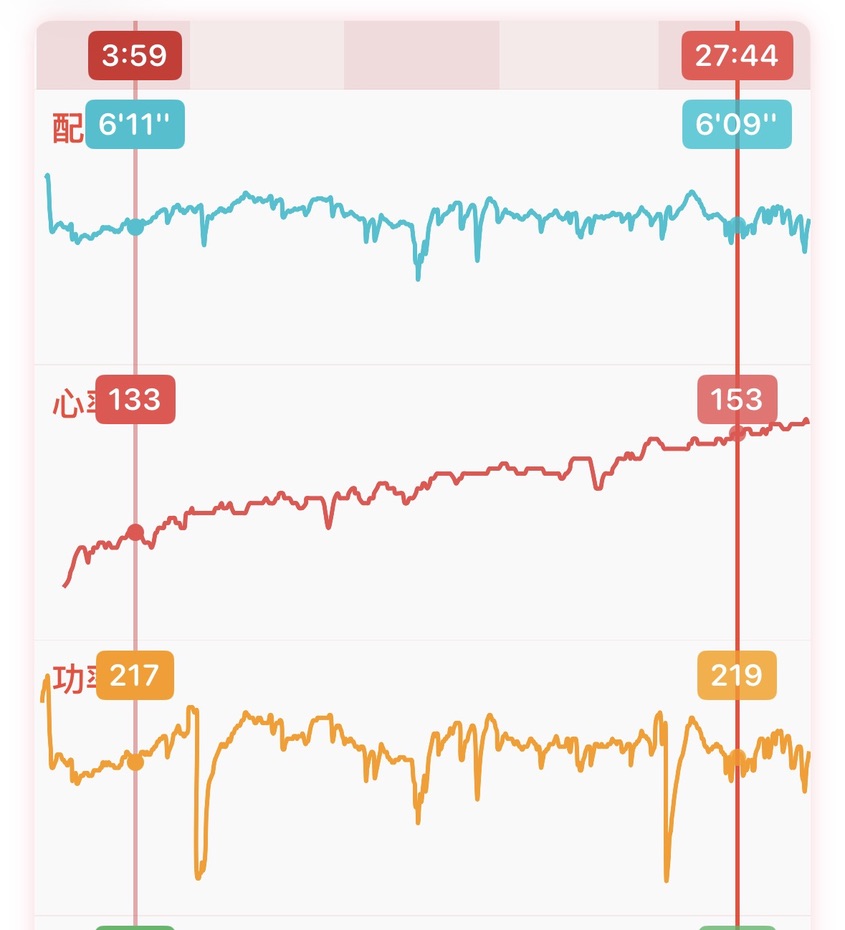
I use this feature most in one scenario: on a run with steady pace, I pull the front segment and the back segment together and see how much heart rate differs — the most direct way to tell whether aerobic fitness has improved.
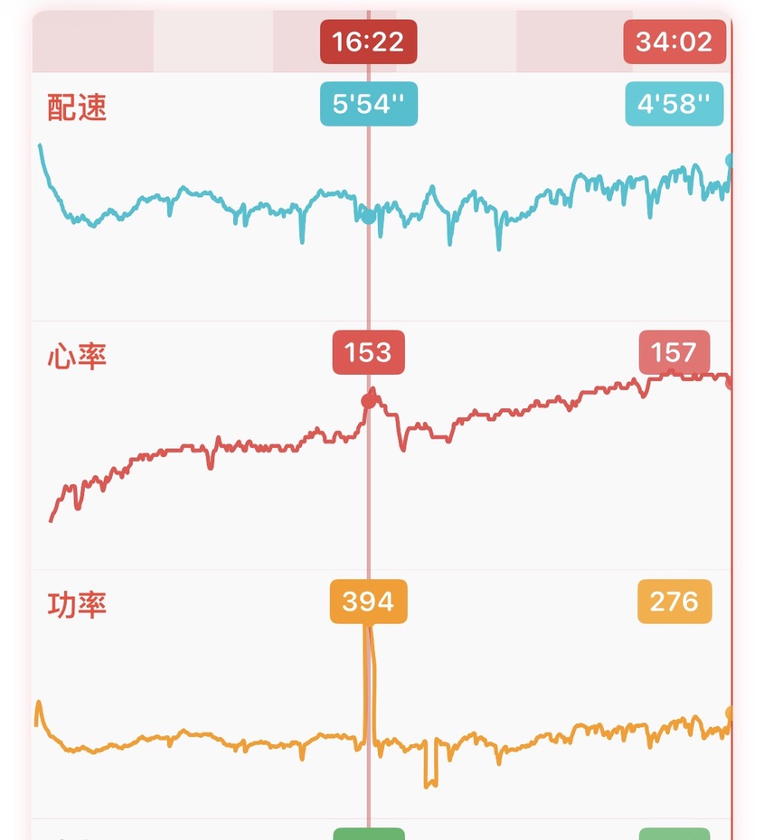
Another discovery came from running along the river. I've been doing bridge climbs lately, and on the uphill the power jumps hard — everyone knows that. What's interesting is heart rate: within one week I ran the hill twice, and the first time heart rate only caught up 5 to 10 seconds after the climb began, while the second time it responded almost instantly.
I asked an AI. Some said fatigue, some said training adaptation, some just said better warm-up — no conclusion yet. But PaceGuru let me see that data.
Available now
Sync Charts has shipped with this update.
-
Works on any outdoor run record (with a GPS track)
-
Supports pace / heart rate / power / cadence / elevation — five curves
-
Runs with a planned workout show segment info as a bonus
Open your most recent outdoor run, tap Sync Charts, and give it a drag.
PaceGuru believes good running data shouldn't make you do arithmetic — it should let you see yourself.